统计文档内所有标签 统计下列标签,返回结果放在一个数组内,均为小写,可以不按照顺序,示例如下。
1 2 3 4 5 6 7 <html > <head > </head > <body > <div > </div > <p > </p > </body > </html >
1 2 ["html" , "head" , "body" , "div" , "p" ]
1
2
3
4
5
6
7
8
function getTags ( var tags = document .all() var res = [] for (const item of tags) { res.push(item.tagName.toLowerCase()) } return res }
第二种:getElmentByTagNames('*') 1 2 3 4 5 6 7 8 function getTags ( var tags = document .getElementsByTagName('*' ) var res = [] for (const item of tags) { res.push(item.tagName.toLowerCase()) } return res }
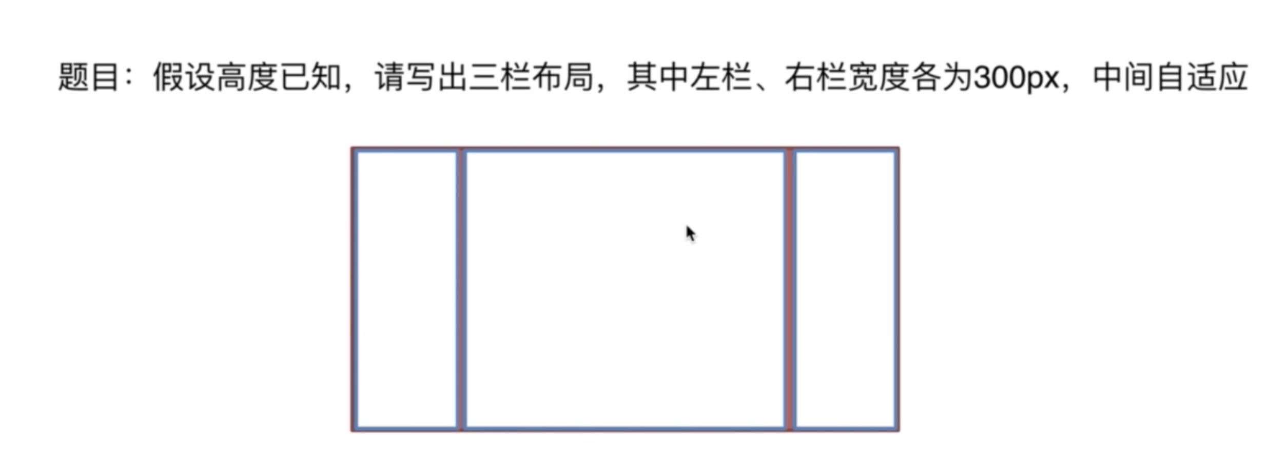
三栏布局,高度已知,左右两栏各300px,中间自适应
介绍下方法和思路
float 布局
左栏和右栏浮动,中间默认
绝对定位
左栏 left:0 右栏 right:0 中间left:300px; right:300px;
flex布局
父元素设置为 display: flex;
设置左右宽为300px
中间设置 flex: 1; 相当于 flex-grow:1;
table布局
父元素 display: table;
子元素 display: table-cell;
左右各为 300px
grid布局
通过设置 row 和 column 来控制
建议将如下代码粘贴到编辑器里查看
1 2 3 4 5 6 7 8 9 10 11 12 13 14 15 16 17 18 19 20 21 22 23 24 25 26 27 28 29 30 31 32 33 34 35 36 37 38 39 40 41 42 43 44 45 46 47 48 49 50 51 52 53 54 55 56 57 58 59 60 61 62 63 64 65 66 67 68 69 70 71 72 73 74 75 76 77 78 79 80 81 82 83 84 85 86 87 88 89 90 91 92 93 94 95 96 97 98 99 100 101 102 103 104 105 106 107 108 109 110 111 112 113 114 115 116 117 118 119 120 121 122 123 124 125 126 127 128 129 130 131 132 133 134 135 136 137 138 139 140 141 142 143 144 145 146 147 148 149 150 151 152 153 154 155 156 <!DOCTYPE html > <html lang ="en" > <head > <meta charset ="UTF-8" /> <meta name ="viewport" content ="width=device-width, initial-scale=1.0" /> <title > 三栏布局</title > <style > html { padding : 0 ; margin : 0 ; } .layout { margin : 10px 0 ; } .left-center-right div { min-height : 100px ; } .left-center-right .left { background-color : yellow; } .left-center-right .center { background-color : red; } .left-center-right .right { background-color : blue; } </style > </head > <body > <section class ="layout" > <style > .float .left { width : 300px ; float : left; } .float .center { } .float .right { width : 300px ; float : right; } </style > <article class ="left-center-right float" > <div class ="left" > </div > <div class ="right" > </div > <div class ="center" > 1. 浮动布局 </div > </article > </section > <section class ="layout" > <style > .absoulte { position : relative; } .absoulte .left { position : absolute; width : 300px ; left : 0 ; }.absoulte .center { position : absolute; left : 300px ; right : 300px ; } .absoulte .right { position : absolute; width : 300px ; right : 0 ; } </style > <article class ="left-center-right absoulte" > <div class ="left" > </div > <div class ="right" > </div > <div class ="center" > 2. 定位布局 </div > </article > </section > <section class ="layout" > <style > .flex { margin-top : 120px ; display : flex; } .flex .left { width : 300px ; } .flex .center { flex : 1 ; } .flex .right { width : 300px ; } </style > <article class ="left-center-right flex" > <div class ="left" > </div > <div class ="center" > 3. flex布局 </div > <div class ="right" > </div > </article > </section > <section class ="layout" > <style > .table { width : 100% ; height : 100px ; display : table; } .table >div { display : table-cell; } .table .left { width : 300px ; } .table .right { width : 300px ; } </style > <article class ="left-center-right table" > <div class ="left" > </div > <div class ="center" > 4. table 布局 </div > <div class ="right" > </div > </article > </section > <section class ="layout" > <style > .grid { width : 100% ; display : grid; grid-template-columns : 300px auto 300px ; grid-template-rows: 100px ; } </style > <article class ="left-center-right grid" > <div class ="left" > </div > <div class ="center" > 5. grid 布局 </div > <div class ="right" > </div > </article > </section > </body > </html >